iisaBahamianbey
Rebrand design for a growing content hub & clothing line in Nassau, The Bahamas.
Concept Development - Brand Identity - Hand Lettering - Typography - Handmade Printing
What is iisaBahamianbey? [eye / iz / uh / buh-hay-mee-uhn / bé]
The expression itself is one of self identification; claiming one’s Bahamian identity and culture. Originally born to empower Bahamian language, iisaBahamianbey quickly evolved into a brand and organization that empowers Bahamian culture through social media content creation and apparel. With a desire to strengthen Bahamian identity, the main goal of iisaBahamianbey is to empower Bahamian culture by bringing it to the forefront of conversation and to give Bahamians access, tools, and resources to share our culture, history, and language.
The Challenge
As iisaBahamianbey was gaining more traction, growing, and evolving, the brand was in need of an expansive and cohesive brand identity. While the brand had a certain look and feel to it already, it was searching for a rebrand that would retain its core message and mission and tie everything together into a system. The brand that started off with content creation and now apparel has aspirations to expand into other areas of business and therefore needed a versatile and expansive brand identity that could stretch with its creative and practical needs in the future.
Providing a platform for Bahamian culture and identity to flourish
What makes iisaBahamianbey unique is its sheer authenticity to the roots of Bahamian language that is so often lost by being told to “speak properly.” The brand initially provided a space for Bahamians to connect with their language and share it with others, and it quickly became so much more than that. Now iisaBahamianbey is an education gateway for Bahamians and non-Bahamians alike, a place for Bahamians all over the world to connect to their roots, and a recognizable clothing line. When brainstorming a concept for this rebrand, it was imperative that it communicated how much of a pillar this brand already is and the strong foundation that it’s building to grow in the future.
Logo beginnings
As the backbone of the brand, I knew that iisaBahamianbey needed a logo that was bold & brassy, yet approachable and fun like the Bahamian people. One of the aims with this lockup was to add some movement and connectivity with the letters. Each letter of the logo was hand-crafted and went through both analog and digital sketching stages before being finalized.
Graphic elements
When brainstorming what the supporting visual elements in this brand system should be, I kept coming back to the idea of something handmade. A lot of the visuals used in brand materials prior to this project had a simple, organic feel to them. I wanted to retain the essence of the brand, while creating a unique graphic system that is versatile, fun to make and easy to use.
All of the graphic elements in this brand identity were made by hand using paint and paper to create a stamping effect, local flora and some found objects. Some rough geometric shapes such as strokes and circles were also created as alternatives to be used in social media posts or other brand communications where needed.
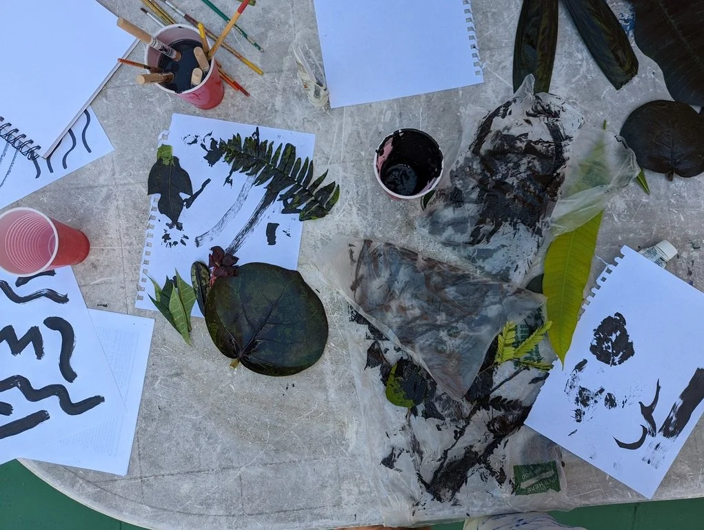
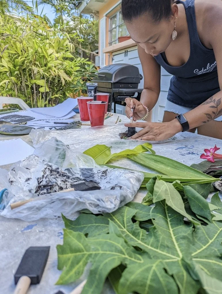
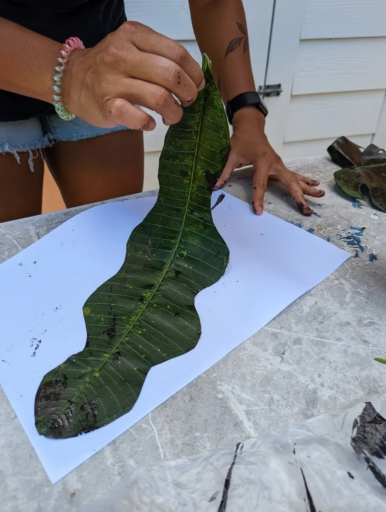

Approximately 43 elements were delivered as vectors, however the great thing about this method of creation is that it allows for more elements to be added to the collection as needed for flexibility and adaptability.
[Credit: Ryan Lewis]
Other visual elements
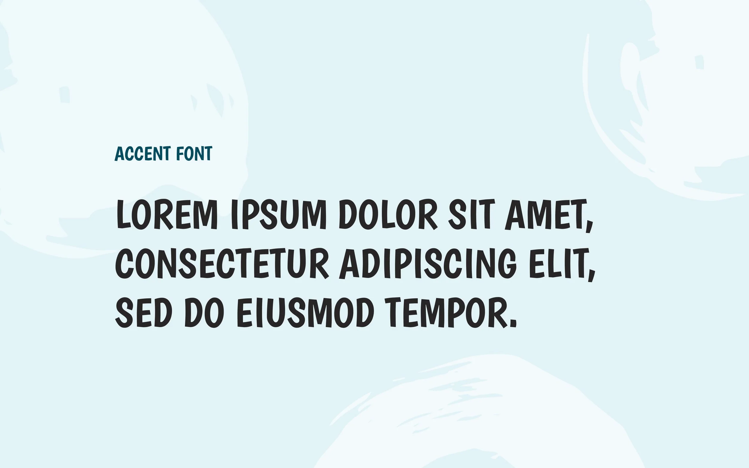
Typography
The brand needed a typography system that would compliment and support it rather than compete with it. Knowing and being an admirer of the brand, I also knew that it needed a “fun” or accent font to use in its communications and collateral. Instead of making one from scratch, I found a great accent font that compliments and supports the custom lettering in the logo, doesn’t compete with it, and retains the same look, feel, and values of the brand.
Color Palette
Knowing the goals that the brand has for its future and its hope to evolve in different directions, I decided that it needed an expansive color palette. This expansive color palette includes both lively pastel colors, darker tones, neutrals and three accent tints for its different collateral.
Photo Treatment
As a brand that incorporates a lot of photography into its content and communications, I wanted to find and outline the ways to incorporate the handmade elements into the brand’s photography style in a way that’s tasteful but not overpowering.